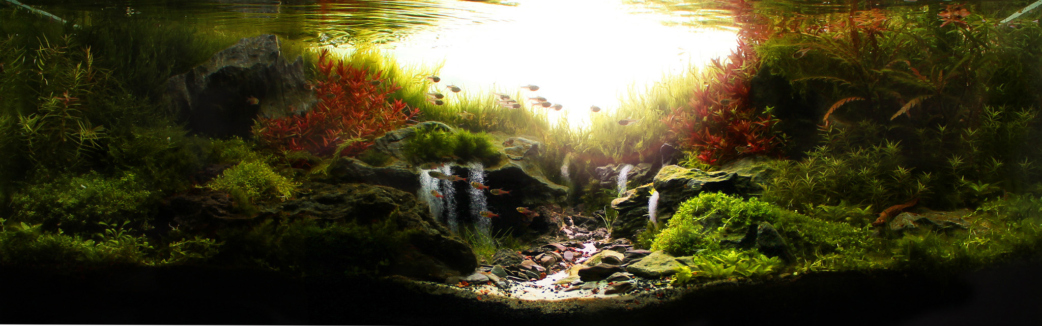
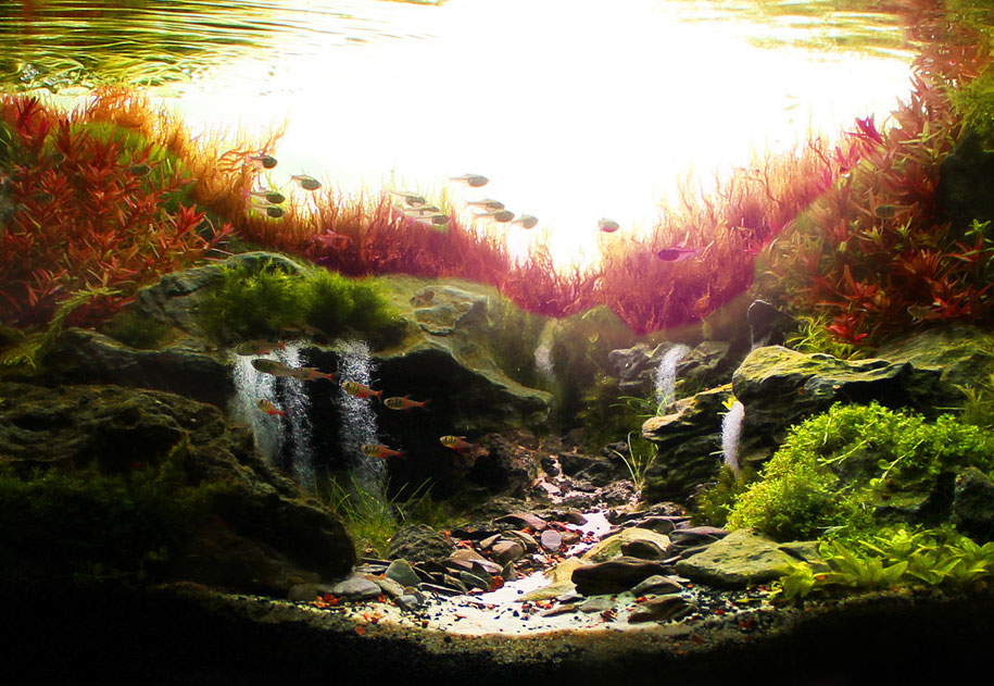
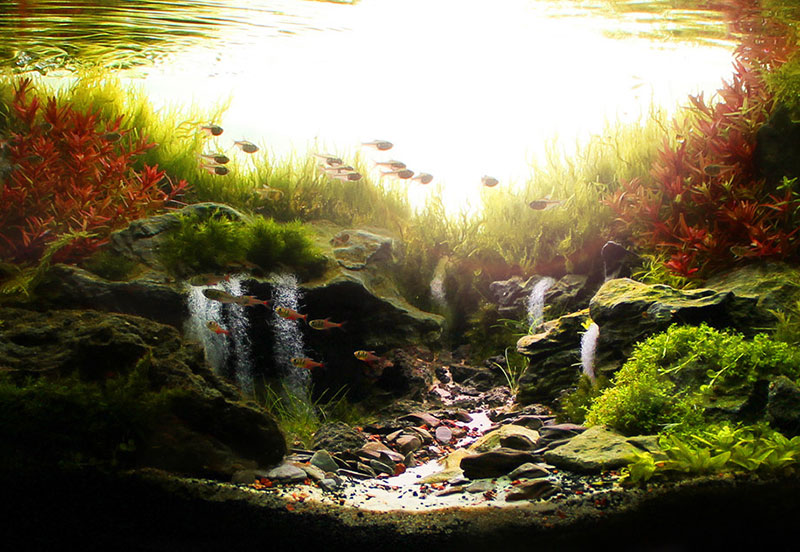
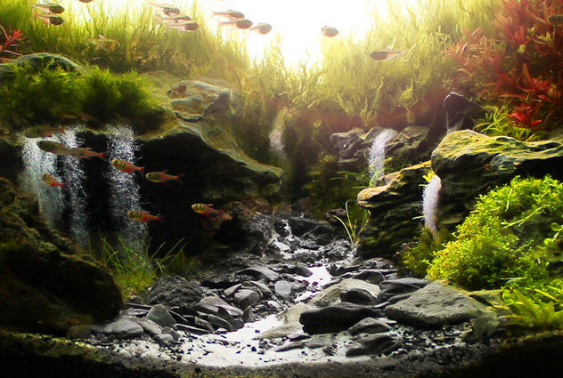
Sunrise in the Valley by Marcelo Tonon Chiovatto
Introduction
A versão em Português deste artigo é em Aquaa3.com.br.The Brazil aquascaping scene is flourishing. One of the best examples of the level of aquascaping being done by Brazilians is Sunrise in the Valley by Sao Paulo aquascaper (aquapaisagista in Portuguese), Marcelo Tonon Chiovatto. It is a beautiful example of the nature aquarium style and, to me, as close to a fairy tale vision as you can get in an aquarium. Oh, and it’s also the 3rd best aquascape in the world according to the 2013 International Aquatic Plants Layout Contest and Best in Show according to the Aquatic Gardeners Association’s Aquascaping Contest 2013.
Like many of us, Marcelo fell in love with the hobby as a child. It’s amazing how far he’s come as an aquascaper. I’m honored and humbled to be given the opportunity to study and learn from Sunrise in the Valley. Thanks, Marcelo!
Summary for the time-limited
Sunrise in the Valley is a wonderful example of the nature aquarium style. Marcelo uses strong primary and secondary focal points (the red Rotala) to draw the eye and anchor the aquascape. He then uses scale, color, hue and placement to convey a perspective of depth.
Marcelo doesn’t rely heavily on the use of triangles but does so just enough to convey the concave composition that it is. He then uses details to add depth and complexity to the aquascape. Although I didn’t like the use of red rocks nor the placement of some larger stones towards the front, these are minor quibbles. Overall, most elements work together to give visual unity and balance.
Sunrise in the Valley earns it’s #3 world title in the International Aquatic Plants Layout Contest and Best in Show in the Aquatic Gardeners Association Contest. It was an honor being able to study it in greater detail.
Full analysis
Initial impressions
It’s hard for me to describe my initial impressions of Sunrise in the Valley. I think it’s because it hits me with so much that my feelings get overwhelmed and shortcircuit as I try to process it. Allow me to go stream of consciousness on you and list what’s going through my head as I take in the aquascape.
I have a habit of first reading the title of the work probably to give me some clues at what the aquascaper was after in creating it. In this case, Sunrise on the Valley is very descriptive and it gives you an immediate mental picture. I can’t remember another aquascape that so closely matches the title with the overall impression. Doesn’t it match perfectly? Can you see the sun just about to break behind the valley with the soft golden hues of morning bathing everything? It’s picturesque, beautiful. The feeling definitely matches the title.
I’m also bowled over by how well the colors work in synergy with each other. They are very natural and pleasing to the eye. Nothing is too jarring. However, the red plants on either side of the valley jump out at me a bit like an aftertaste. They are clearly focal points.
Yes, the waterfalls are obvious but they blend in well with proper proportion and scale. Marcelo clearly used them to define perspective and give the impression of a deeper aquascape than is reality. They are tasteful. That’s hard to do. Waterfalls are typically reserved to gimmicky aquariums but in Sunrise in the Valley, they work well.
I see the golden ratio in the composition and some triangles. However, I think it’s subtle. The aquascape is a soft “V” concave composition. Marcelo seems to have used some design principles but kept it subtle enough to give the aquascape some individuality and personality.
Lastly, detail seems to be very good towards the middle of the aquascape. Clearly around the valley. The detail gets less and less as you go out to the sides of the aquascape. This gives the overall aquascape a dreamy type of quality that I like. Almost like giving a portrait an unfocus mask.
Let’s see if the aquascape holds up to my initial impressions.
Analysis – how elements are used
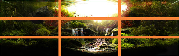
Rule of Thirds
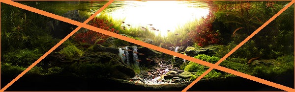
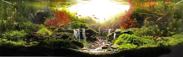
As always, let’s begin our journey through Sunrise in the Valley by look at the composition itself. One of the most fundamental techniques used to create a pleasing composition is the use of the rule of thirds. You can see it superimposed over the image below.
Each line represents a third of the image and intersections are places where the mind would expect a strong focal point to be. This is the case with Sunrise in the Valley. The left vertical line falls squarely on the left one-third of the image. You would then expect the heaviest part of the composition to be there, which it is. Notice the left vertical line intersecting the top horizontal like exactly on the red Rotala. Bingo, as I suspected, the left Rotal bunch is a focal point for the image.
Marcelo uses color to highlight the focal point. This is a good technique but too much can throw the composition’s balance off. I think, in this case, the red highly works.
Notice too that the right vertical sits on the right side of the bank and touches the red Rotala bunch on the right? This is hinting at a second focal point for the aquascape. Marcelo uses scale to make this more of a second focal point I think. The intent is for the eye to first focus on the left and then cross to the right.
However, I feel that the waterfalls compete with the red Rotala on the right, as a second focal point. My eyes first see the left red Rotala and then begin a move to the right but they get sidetracked by the waterfalls before landing on the right red Rotala. Now, maybe that’s because of my low attention span and getting easily distracted. 🙂
I can’t help but wonder if the composition would be stronger if the left waterfall with all of it’s bulk, were sitting to the left on the left vertical third. Hmm, maybe.
In any event, please take into account the use of repetition or rhythm in the use of both Rotalas. They seem to echo each other. This makes us feel like if there’s order to the composition and it gives us comfort. A sense of peace and tranquility.
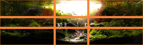
Golden Sections
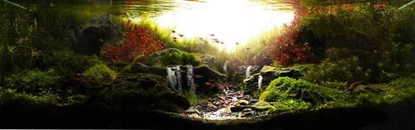
Much like the Rule of Thirds, the Golden Sections, pictured below, try to tease out the strength and balance of a composition. However, the Golden Section, or Golden Ratio, uses a mathematical basis for arriving at it’s conclusion. The ratio is 1:1.618 and can be seen below.
With this view, you can see that the heavy water fall section is sitting in the left vertical, not the red Rotala. Same for the right waterfall and red Rotala. Those this mean I may not be correct about the Rotalas being focal points but rather the waterfalls being the focal points of the aquascape?
Before moving on, notice how the Golden Sections dissect the aquascape into foreground, middle and back. Marcelo’s choice of planting seems to be right in line with this.
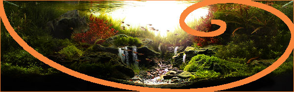
The Golden Spirals
The Golden Spiral shares the mathematical ratio that the Sections use. It’s purpose is to try a indicate the most natural location for focal points in the composition. Remember I said that I thought the red Rotala were focal points but that the waterfalls competed with them. Let’s see if I was right!

The Golden Spiral left shows us that, sure enough, the left red Rotala bunch is definitely a focal point of the aquascape. It’s not perfect, but close enough that I am very comfortable with the conclusion.
As we can see from the image below, the right red Rotala bunch is also indicated to be a focal point. Again, not perfect but close enough to conclude that eyes will find it natural to focus there. Due to the smaller size, I would say it is secondary to the left Rotala. However, because it seems to be better light (lighter) than the left bunch, it is a very close second. Lighter subjects command more attention than darker subjects and they appear closer.
The take away here is that you can establish a hierarchy in a composition by changing the size and color of sections. You need to be very careful, particularly in the lighting, or risk unbalancing the aquascape. Here, I think the size and the bulk of the left waterfall outweigh the lighter/brighter red Rotala on the right, therefore, I would say it’s a secondary focal point.
Use of color as a design element
We’ve established that the two red Rotala are focal points. We’ve learned that Marcelo used color, hue and scale to distinguish between a primary focal point and a secondary one. Let’s see what would happen to the overall composition is Marcelo had chosen to use red plants to fill the middle background?
That would have take away from the focal points, right? They now get lost because red is everywhere and your eye can’t find a contrast point. Scale and highlight here don’t matter. That’s the point, there is a dominant element that will provide the requisite contrast. In this case, it’s color. When you’re using bright, powerful colors, color will almost always be the dominant element.
Let’s see what would have happened if Marcelo used green Rotala with the color only in the back? As you can see below, the focal points are completely washed out. Now although we would want them to be there, without the right color and contrast, we would end up with an unbalanced composition.
Same thing would happen if you didn’t use red at all. What do you think? There’s no contrast.
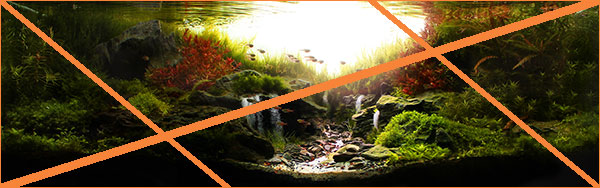
Similar to the above rules of thumb, Golden Triangles are a way to see if the composition will be considered natural when viewed. As I’m written about before, our brains are wired to look for patterns. They are comforting and bring order to chaos. There is no better or more familiar pattern than triangles. Let’s see if Marcelo makes use of triangular layout to reinforce his composition.
Golden Triangles
The Golden Triangles, pictured below, again reinforce the left focal point (i.e., the left Rotala bunch). However, the use of triangles seems to be limited in this case.
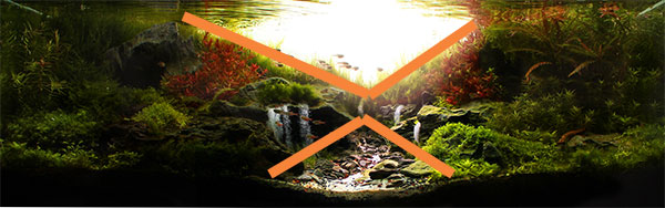
Flipping the Golden Triangle horizontally, we can start to make out some triangles. Notice the intersecting diagonal line seems to match well with the background. Come to think of it, the above picture also shows the diagonal being matched well by the diagonal.
Let’s superimpose the diagonals to explore this point further. As you can see below, The upper middle seems to form that “v” shape that is characteristic of some concave compositions. However, please notice that the valley itself also forms a triangle. I hadn’t noticed this before. This is why I love analyzing aquascapes, it reveals the hidden elements within.

Here are the two triangles that are subtle but there. They echo each other and lend a sense of order and visual unity. Had you seen them before?
Let’s now explore some elements of the composition that really define it. Without these elements, the aquascape would lose it’s sophistication and complexity. It wouldn’t have the depth that it has.
Perspective
The first element is perspective. As you can see below, I think Marcelo does a fine job to give the impression of a 3D space within the 2D photo. The aquascape looks deeper than it really is because Marcelo incorporated some key elements that give Sunrise in the Valley that far away, distant look.
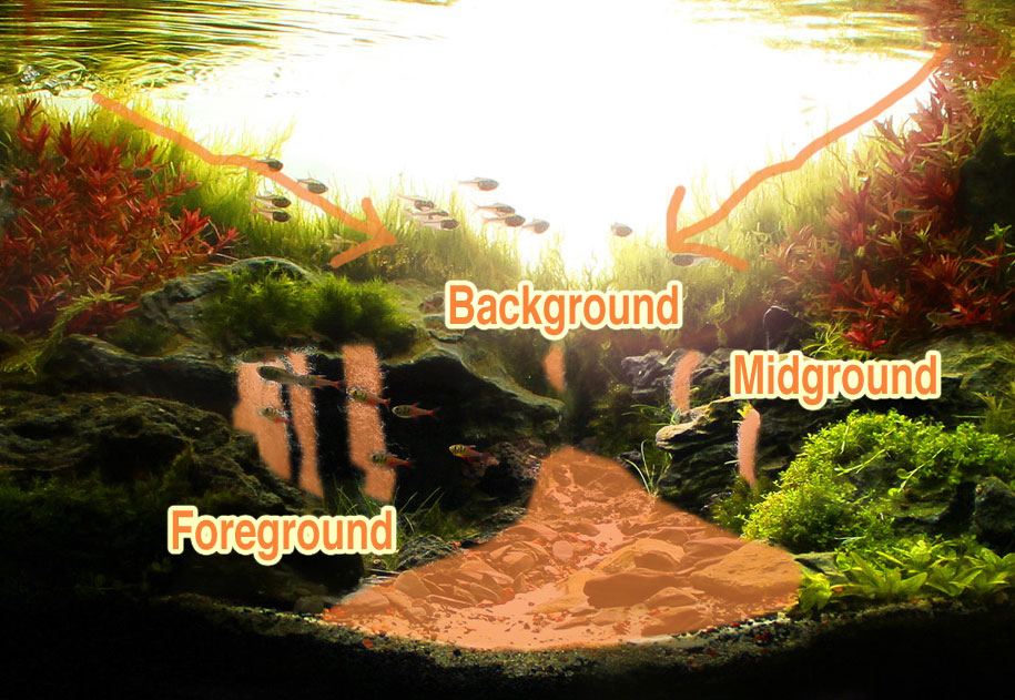
There is a clear separation of foreground, middle and back that is respected though out the composition. Marcelo then uses the waterfalls in different heights to evoke a perspective of distance (being far away). The triangular valley path also gives the impression of distance because it’s wide at the front and short at the back. The rocks on either side serve to reinforce this illusion. However, I do see some of the rocks on the right side of the valley that are too big to be so close to the front. Also, the big boulder behind the word Foreground also seems too big to be towards the front as it detracts from the feeling of perspective.
These are minor quibbles, however. I think Marcelo does a good job overall in building perspective into his masterpiece.
Details
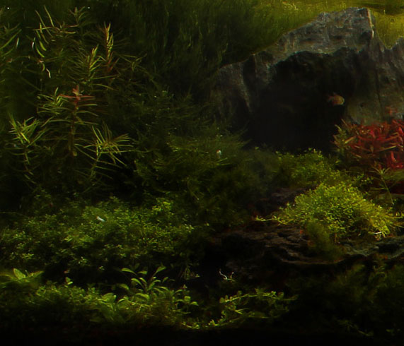
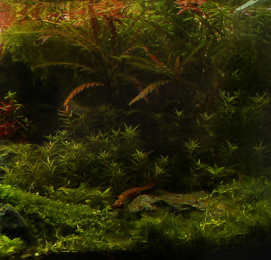
Details are another element that is strong in Sunrise in the Valley. In any aquascape, details are what give depth and complexity. It’s appreciated and fun. For the observer, it’s like peeling an onion (if that were fun) because there are layers underneath that are even juicier than the last!
The below two close up shots depict some of the details, most of which are present in the center of the aquascape- the valley. They draw your eye into the composition and then towards the back (distance). Marcelo uses different sized stones to accomplish this interest.

Looking at the above image, I did spot something that gave me pause. The rocks are reddish in color and they captured my eye immediately. To me, they seem to be a little distracting because of the color. Remember what I mentioned before, red elements are tricky to use. Care must be taken when using them so that they don’t overpower other elements.
Through the magic of computers, I’ve taken the liberty of removing the red from the stones in the shot below. Don’t they now match better with the other elements? They are not competing for your eyes.
 In the shot below, I changed all the stones to a unified slate color. Notice how it’s become almost black and white? Boring and missing life? This shows that you need some color, like the yellow and greenish stones with brown hues. However, too much color (e.g., red) and it throws the balance off.
Overall color can also play a major role. It’s critical, typically, in setting the mode of the aquascape. Remember that it’s all about feelings. Ambience, though lighting, can make or break an aquascape. Notice the below image where I’ve removed much of the shadow from the original. Does it still feel like sunrise? Not to me, now it’s more like high noon in the valley! The fairy tale like mood is gone. You must focus on what you are trying to convey and then use elements (be they details or ambient lighting) to achieve the feeling you’re after.
Now, let’s look at some of the subtler details and see if we can figure out why Marcelo used them. First, let’s look at that big stone on the upper left in the picture above. You can see it sticking out behind and above the left Rotala. To me, it adds weight and interest to that side. It is reminiscent of a mountain breaching the tree canopy in the distance. It depicts age and permanence. What would happen to the overall aquascape if it wasn’t there? The picture below does exactly that.

Isn’t the aquascape less without it? There’s a good rule of thumb, if it’s more without it, then remove it. However, the opposite is true too. If it’s less without it, then leave it. This is the case here. In my opinion, the aquascape is much more with it than without it.
How about the plants on the right background. When I noticed them, I wasn’t too sure about them. You can see them in the picture above. Are they necessary? Do they add? Let’s see. The picture below has them removed.
Again, I think the aquascape is less without them. They lend visual interest and some weight to that side. Although at first I didn’t know why Marcelo chose to add them, it makes sense now. Could Marcelo have use something else, like a smaller stone, to add symmetry on that side, I don’t know. However, the plants work.

Well, what about if we took away the stone on the left AND the plants on the right? Wouldn’t that balance the composition? What do you think? In my opinion, it detracts from the complexity and visual interest of the overall aquascape. Reminders of mountains are gone. Height is missing as that was given by the tall stem plants. Definitely, Marcelo was right to use those elements.
Overall color
Finally, let’s focus on the colors used in the aquascape. As you can see from the color wheel below, the colors of the aquascape tend to bunch up on two sides of the wheel.
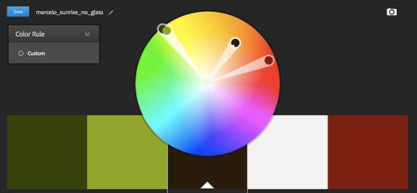
It may prove to be more pleasing to have a triad color layout that represents a more dynamic color selection for the aquascape. The image below shows what I mean. Notice the blue leg added to complement the other two forming a triad.
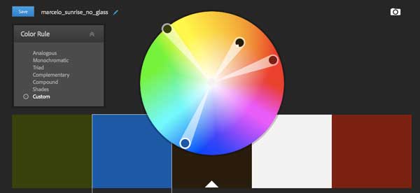
The question is, how do you get blue into an aquascape? And, no, the water doesn’t count. What would be clear, right? Check it out in a white bucket!? Oh I just made all the old timers from the Aquatic Plant Digest laugh…
Well, typically, blue is added via the background of the aquascape. However, in this case, it’s clear and it should be as we are depicting a sunrise. Another way is by adding blue fish. In Sunrise in the Valley, I feel that the fish get washed into the aquascape. I’m sure, when viewed in person, the motion of the fish comes into play and they contrast sufficiently. However, as we are looking at an image (much like contest judges), the movement is irrelevant.
By making the fish blue, the needed contrast and color is added. The image below has the fish painted blue. Don’t they stand out more now and contrast well with the reds and the greens? Thank the color wheel, my friends.

Manicured?
The one area where I felt the aquascape was a little weak was on the sides. In the beginning, I said that the sides lost focus on purpose to create that unsharpen mask effect you see in portraits. However, upon closer scrutiny, I see that the sides are a bit on the wild side. See the below two images for a close up of what I mean.
I would expect the sides to be a bit more manicured. However, it may be that Marcelo purposefully left the sides unkept to reinforce a natural jungle effect. If this is the case, I understand. I still can’t help but think that it detracts slightly from the overall aquascape in any case.
Interpretation – finding meaning
To me, Sunrise in the Valley is in the nature aquarium style. This style tries to depict a scene of nature in the aquarium and most of the winning aquascapes in the recent International Aquatic Plant Layout Contests have been all about natural depictions. They almost boggle the mind.
Sunrise in the Valley perfectly conveys it’s meaning- watching a valley from afar at daybreak with the rising sun bathing everything in a golden hue. It has atmosphere and character. I can almost feel the cool, brisk air and the scent of daybreak.
As a result of the design choices Marcelo chose to use, the aquascape gives one a feel of transcendence, tranquility and peace.
My Opinion
After going through Sunrise in the Valley in careful detail, I think it is a wonderful example of the nature aquarium style using a concave layout. It’s masterful use of color to highlight focal points and its subtle use of scale, makes Sunrise in the Valley a masterpiece. It certainly earned it’s 3rd in the world and best in show titles.
Marcelo is truly a talented and hardworking aquascaper. I can’t wait to see what he brings to the international stage this year. In fact, I can’t wait to see what all the Brazilian aquascapers bring this year!
Marcelo, thank you for allowing me to study and learn from your work of art.
Don’t let me have the last word, what do you think of Sunrise in the Valley? Leave it in the comments!
All the best, my friend
Art
Important notice: All original images of Sunrise in the Valley are the copyrighted property of Marcelo Tonon Chiovatto and used here with permission.
4 Comments on “Analysis of Sunrise in the Valley”
I have no words to thank you for this excellent analisis of Marcelo’s work.
Congratulations my friend! I learned a lot with you today!
Luca, what a nice thing to say. Thank you! Best regards, Art
I love your detailed analysis of these wonderful aquascapes!
Great job!
I’m looking forward to read more of these!
Best regards
Timo (aquascapia.de)
Thank you, Timo! I’m working on the next one! Regards, Art