It is my honor and pleasure to have the opportunity to analyze Forest, a stunning aquascape by Viktor Lantos. Viktor is one of the owners of Green Aqua, an aquarium store located near beautiful Budapest, Hungary. The store is one of the few European aquarium shops that specializes in the nature aquarium, aquascaping and planted aquarium field. Viktor is the founder of the Hungarian Aquascaper Forum (akvakertesz.hu) and founder and a judge in the Hungarian Aquascaping Contest (HAC). He’s placed highly in the IAPLC since 2010 (96 in 2010, 80 in 2011, 67 in 2012, 171 in 2013).
There is no question that Viktor is one heck of an aquascaper and a huge, positive driver in the growth of our beautiful hobby. He’s passionate and it comes through in all of his aquascapes and in the design of Green Aqua. You would be hard pressed to find a more appealing design to an aquarium store specializing in aquarium plants and aquascaping. However, when I reached out to him, I was surprised to find out that he is very humble about his talents. He described his aquascapes as average rather than exceptional. Well, as I think you would agree, it is clear that Viktor is no average aquascaper. His works are creative and powerful. They make a statement, and I like that. Let’s dig into Forest and see what lessons we can learn from our friend and master aquascaper, Viktor Lantos.
Initial Impressions
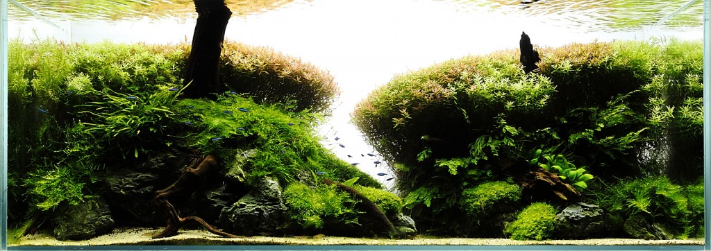
The first thing that strikes me about this aquascape is the sculpted bunches of Rotala in the background. It’s reminiscent of the jardin à la française style based on symmetry and the principle of imposing order over nature. It’s somewhat harsh and hedge-like but at the same time tempered by the beauty of the red hues and symmetry. I think they are there to represent the forest of trees, hence the name. The forest theme seems to be carried on by the use of the two, somewhat symmetrically positioned, pieces of wood giving the impression of tree trunks.
The edges of this forest seems to be the defined by the mid and foreground in the form of bolbitis, anubias and weeping moss. This gives me the impression of moss covered rocks. The choice of seiryu rock was good, I think as the slate color contrasts well with the green and enhances the impression of old, solid, weathered stone.
The aquascape is a classic concave composition with it’s U shape. It adds depth and complexity by having a sandy foreground that contrasts very well with the slate of the stone and the lushness of the plants in the background. I’m unsure about the placement of the branches in the foreground, however. I imagine they are there to enhance the forest, trees theme and impression and, to some extent, I can see that. I’m just not sure.
Finally, the left to right path down the middle is a nice touch, I think. It enhances the depth of field and gives interest to the overall composition. It’s curious that it didn’t draw my eye as quickly as these elements typically would. I wonder if our analysis will reveal that it’s only a subtle focal point?
Speaking of focal points, can you easily tell where the focal point of the aquascape is? I can’t. This could mean that there are more than one focal point and our eyes can’t decide or, less likely, there are no focal points. At this point, I’m willing to bet that the aquascape does have a few focal points but they are more subtle than we’re used to seeing. Let’s find out by digging into the analysis!
Rule of Thirds
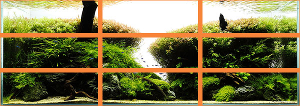
Applying the rule of thirds to the aquascape, we can start to see how it conforms to the standards of fine art. Viktor tells me he doesn’t pre-measure his compositions but, rather, eyeballs it. He does have a background in graphics arts, however, and it is showing when you consider how Forest matches up with this tried and true rule.
As we stated above, the aquascape doesn’t seem to have obvious focal points and the rule of thirds tends to confirm this. You would expect to find the focal points on the lines and intersections. You don’t see that here. What you do see, however, is a harmony with the rule. Notice how the mass of the Rotala tops fit nicely into the uppermost third of the image following the top line of the rule. Then the mid ground, composed mainly of bolbitis and moss and defining the edge of the forest, also lines up well with the middle third of the rule. The bottom third is where you find the moss and see much more of the rocks. It’s subtle, I admit but the harmony with the rule is there and, sometimes, that’s enough.
Would the composition be stronger if the left wood trunk were a few inches to the right and sitting on the left vertical line of the rule of thirds? Probably. I think, visually, it would give a stronger impression of it and really make that tree trunk a focal point of the aquascape. However, the darkness of the wood hides its beauty and texture as all you see in the photo is the silhouette. So, maybe you don’t want that to be a main focal point and, if so, you would keep it off of that line.
Golden, Harmonic Triangles and Diagonals
I’ve mentioned many times that we are hardwired to see triangles in things. They give us a sense of order and tranquility. Sometimes they are very obvious and sometimes they’re not. I think in the case of Forest, Viktor instinctively places elements in a triangular fashion to some extent.
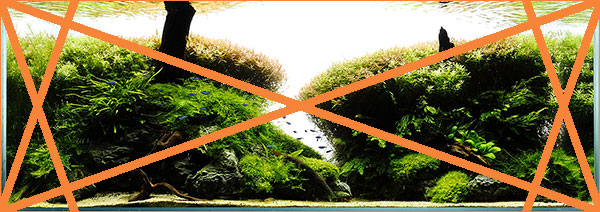
Look at the picture above that shows the golden triangles with a left to right orientation. See the long diagonal line that crosses the entire aquascape from the top left to the bottom right? Notice how elements of the composition all along that axis?
Starting from the top left, the line divides the green rotala from the red. The line continues and intersects one of the smaller golden triangle sides exactly at the base of the branch. Remember how we said that maybe this branch was a focal point? This gives some support to that. Anyway, the line continues its path demarcating the red rotala from the weeping moss, the exact point where the right rotala bunch stops and then the branch with anubias before ending in the opposite corner. It’s always interesting to see how aquascapers place elements almost exactly on these triangle sides because their guts tell them to.
The other thing I notice from the above is that the left rock formation seems to echo the large triangle on the bottom left. It’s not exact but you can definitely see the triangular shape of the structure. Let’s now check out how Forest does with the harmonic triangles.
Well, I think there’s some interesting stuff here. Harmonic triangles take the point that we look for triangles and interposes symmetry to them. It’s useful for seeing this type of design technique and what we would call “balance”. I mentioned that symmetry was one of the first things that hit me about Forest. I think I’m starting to see why by looking at this picture.
First, note how the aquascapes has an inflection at the mid point almost equally on either side. Was this intentional? I don’t think so. Maybe instinctual? In any event, it does enhance the symmetrical aspects of this composition.
The second thing that I see is how the top of the aquascape reflects, somewhat, the upper middle triangle. It’s open (or negative) space. I do think this was intentional by Viktor. He was trying to get that concave composition and the plant trimming is consistent with that. It’s important to notice how the rotala on the right stops exactly at the mid point of the aquascape. I think Viktor sensed this and knew he had to stop it there.
Overall, I think it’s a loose fit and what the harmonic triangles tell us most certainly, is that this composition is trying for symmetry.
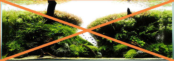
No analysis would be complete without a look at the diagonals, or as I call it, the X marks the spot. The conclusions reached with the harmonic triangles keep with this view as well. The top triangle in the middle echoes the negative space fairly well. The rotala on the right end at the exact midpoint of the composition.
I think that the composition would be stronger is the rotala on the left were trimmed back further leaving more negative space on the left. This would create a focal point on the right rotala created mostly through position and the size difference between the two. Let’s move on to explore the focal point enigma that this aquascape presents.
Golden Spiral and Focal Point
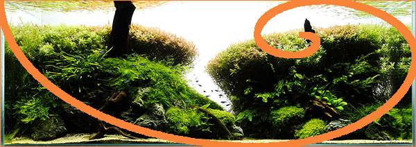
I use the golden sections, a cousin to the rule of thirds, to try and see the overall position of the composition. It also helps to check on symmetry. As you can see, it is symmetry that is being highlighted. The composition doesn’t seem as symmetrical as I thought previously due mainly to the height difference between the left and right Rotala. However, the intersection of the lines right over these bunches may indicate a subtle focal point there.
The golden sections also give a good indication of fore, mid and background sections. With Forest, you can see how well Viktor kept to this. His mid ground especially is very well-placed. However, we get very little in trying to answer where the focal points of Forest are. Let’s bring out the big gun, the golden spiral.
Bingo! The golden spiral is telling us that the wood branch on the right may be a focal point. It’s interesting, right? Did Viktor mean this to be a focal point or was he simply going for symmetry with the larger branch on the left? Note, however, that the black wood hides the beauty and details of the wood in photos. Here we see mostly the silhouette. Is this what the aquascaper intends? I don’t know.
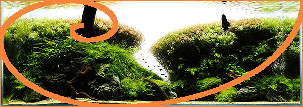
What happens when we place the golden spiral in the opposite direction?
Whoah! It agains seems to indicate that the branch is a focal point. Now, do you think Viktor took this into account and placed the two branches in these exact positions intentionally? Well, I don’t know. We have to ask Viktor. What we can say is that they are in the position that the mathematical equation designed to tell us where focal points should be says they should be. They are not main focal points. Perhaps, if we say more detail and the wood was lighter in color, the focal level would be higher.
For now, I think we have solved the mystery and can say that Forest does have more than one focal point and they somewhat compete against each other. The dominant would be the left given its greater size.
Depth of Field and Perspective
Perspective is the way things appear to the eye based on their spatial attributes, or their dimensions and the position of the eye relative to the objects. Depth of field, as used here, refers to how deep an aquascape looks relative to its true depth. Don’t think in photography terms as I’m not referring to what is or isn’t in focus.
To me, Forest presents us with a linear perspective. That is, we are looking linearly straight ahead. To great depth in linear perspective, an aquascaper must work with contrast to give the impression that some elements are further away than others. This is typically done using size, color tone, etc.
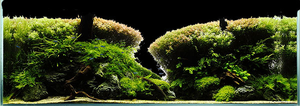
The path that intersects the aquascape in the middle and from left to right is a technique designed to give depth. I don’t think it enhances the depth of Forest very much, however, because it’s very hard to see. More visual contrast at the entrance tot he path would highlight it more for the eye. For example, leaving more of the bare rock and, maybe, having some smaller stones drawing the eye into the path.
You can see this if I black out the background in the image below. Notice how the two sides don’t really seem too far apart.
Having said that, I do think the red tone of the rotala in the middle of the aquascape certainly adds to its depth. Notice how Viktor intentionally planted green on the sides and red toned rotala in the middle. Granted, this may be the result of the higher light levels if the light is more intense in the center. However, here, it works.
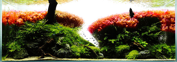
Notice also that it’s not overdone. Viktor’s experience as an aquascaper and visual artists comes through giving the requisite depth and complexity without being overbearing and gaudy. Too many beginning aquascapers think that contrast is necessary and they over do it. See the image below where I took the liberty to pump up the red as if rotala macranda was used.
The aquascape looses its sophistication, no?
Design Elements
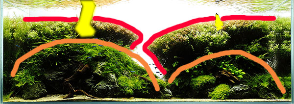
Design elements are very important to any composition. Forest, to me, is all about symmetry. It gives it balance giving the overall impression of tranquility and order. See the image below where I highlight the major symmetrical points. There are, of course, many other minor ones.
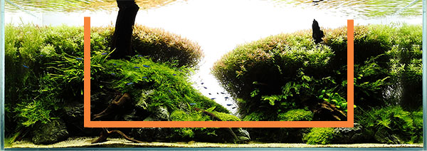
We discussed the layout style. Although we are discussing it towards the end of this analysis, it’s typically what I look for first. It informs me about what to expect and gives me a starting point. Forest, is the prototypical “U” layout. Very well executed. It’s very welcoming and open, friendly. Notice the orange smile? 😉
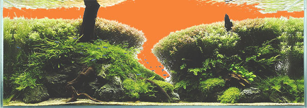
The use of negative space is also highly important. You don’t want an aquascape to feel cramped. Unfortunately, it’s one of the hardest techniques to learn for beginners. Without good negative space, an aquascape won’t be balanced.
In the case of Forest, I’ve highlighted the negative space in orange. I would say that it’s about a third of the scape. In my experience, that’s a great proportion for overall good compositions.
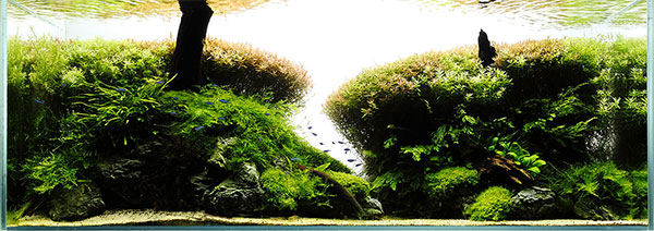
There is one element that I wasn’t sure about earlier. It’s that branch buried in the sand in the lower left. As I mentioned, I think I understand why Viktor included it. It echoes the theme of trees and forest. It may give some weight to the left side. But, I’m still just not sure. Why don’t we see what the aquascape would look like without it? I’ve done just that automagically.
Well, there’s this open space there with too much black. Perhaps a stack of moss covered rocks would better fit the overall aquascape? Eh, I just don’t know. It can go either way here.
Color Choices
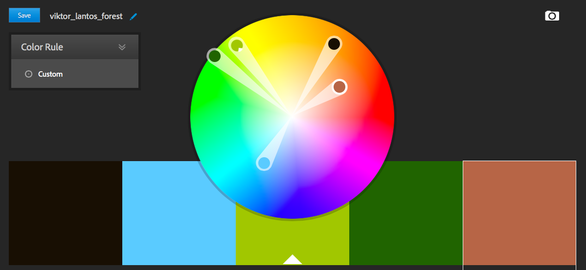
As you can see from the color chart above, Forest has a somewhat triadic color scheme. This indicates relatively good contrast that is visually pleasing. No clash of colors is noted. However, the blue is taken from the green neon tetras Viktor chose to use. In the photo of the aquascape, it is difficult to see the fish so I don’t know how much that contrast counts. Perhaps in person the fish are more obvious.
Although I can’t tell from the photo, in this aquascape, I think a noticeable cloud of blue neons would be stunning.
Final Impressions
Overall, Forest is a wonderful aquascape created by a master aquascaper. Viktor does follow established visual rules albeit in his own way and always loosely. That’s fine. When you step back and look at the beauty that is Forest, you see that the synergy of following (and breaking) the established rules, through the hands of experience and talent, results in something amazing.
Symmetry is what struck me at first and the analysis only reinforced that feeling for me.
Thank you, Viktor, for allowing me the privilege of learning from you work. My best compliments and I look forward to your next one.
Best regards,
Art
How about you? What do you think of Forest?
Important Note: The unmodified images used in this article except for color wheel are the copyrighted work of Viktor Lantos and used with permission. Modified images are copyrighted by ScapeFu.com All Rights Reserved.





One Comment on “Analysis of Viktor Lantos – Forest”
Pingback: Scape Fu a new planted aquarium podcast - Page 3 - The Water Bucket - Aquatic Plant Central