
Hi!
This is the FIRST ScapeFu Friday Challenge! Yay!
Up first, contrast in aquascaping!
Let’s define contrast in aquascaping:
Contrast refers to the arrangement of opposite elements (light vs. dark colors, rough vs. smooth textures, large vs. small shapes, etc.) in an aquascape so as to create visual interest, excitement and drama.
If you want your aquascaping to improve, you need to learn techniques that build visual interest into your aquarium. Nobody likes a bland painting. Breath life into it by telling a story with your aquascape and contrast is just one way of doing just that.
So, your challenge for today:
Take a picture of contrast in YOUR aquascape and post it in the comments below!
Let’s have fun and all learn together! Now, go! Take that picture and post it!
Attachment guidelines: max. 8 megabytes and only jpg, gif or png file formats
Here are some examples:
Example 1: Contrast using the color and shape of fish

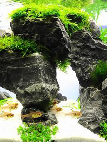
Example 2: Contrast using rock, plants and substrate
Example 3: Contrast using fish, plant color and plant leaf shape


5 Comments on “Use of Contrast in Aquascaping – ScapeFu Friday Challenge”
Challenge accepted. Here is a pic from a past tank. Lots of contrast with color and shape.
Attachment
Nothing but contrast.
Attachment
many different shades of green with some splashes of red from A. reineckii
Attachment
Sorry I’m a little late. Contrast with dark and light plants as focus.
Attachment
Contrast with colors and size
Attachment