![]()
The 2010 Iron Aquascaper competition at the Aquatic Gardeners Association Convention featured a heated battle between Luis Navarro and Frank Wazeter. Luis is a seasoned aquascaper with many years of experience. Frank is the relative newcomer who’s come a long way in a short amount of time. Although Luis ultimately came out the victor, I think all spectators were satisfied that these two guys really put on a show. In this post, I humbly attempt to determine why Luis was chosen the winner over Frank in as objective a fashion as I can.
The Iron Aquascaper contest is not an easy competition. The combatants are given their materials and with them, they must create an aquascape using their skill and knowledge of aquascaping. Essentially, it’s all about the composition. It is with that in mind that I immediately determined that Luis’ aquascape was a better executed composition. I was curious as to why I could make such a fast determination without further and deeper study of both. I decided to use math and some age-old composition techniques to see if my first impression was correct.
I do want to make this interjection right at the outset. Let there be no question that these two gentlemen could handily kick my butt if I were pitted against either one of them in an aquascaping competition. As a result, I feel a bit self-conscious about giving a critical eye to their work. However, I hope that by using objective techniques that have been used for centuries to determine composition in artwork, the thoughts I share in this post will be taken in the spirit of shared discovery and learning rather than any form of negative critic. Now, on with the show…
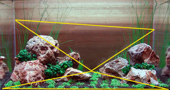
Luis chose to use what I believe to be a traditional (style II) sanzon iwagumi style. In this style, a main rock (Oyaishi) forms the foundation of the composition and it’s supported by a large secondary rock and then supporting rocks. The arrangement typically uses three rocks forming a triangle because of its more natural appearance. Here, curiously, Luis chose to use 4 rocks supporting what I believe to be his Oyaishi (the skull-looking rock). To me it tends to disrupt the strength and balance that would otherwise be there. The Oyaishi is also a bit small to be the focal point although this is somewhat made up by the skull features of the rock.

In contrast to Luis, Frank chose to use driftwood as his main material and used rocks as supporting elements. My first impression was that the rocks didn’t really support the driftwood but rather seemed scattered about. Moreover, I found that although the taller wood to the right was fighting to be the focal point of the composition, the center positioned, and moss covered, piece kept drawing my eye back to the middle. This weakened the overall effect.

The Rule of Thirds
Many of you know about the rule of thirds. It is just a compositional rule of thumb commonly used in photography, painting and design. It is commonly used in judging aquascapes and so I use it here. The rule simply states that an image should be imagined as divided into nine equal parts by two equally-spaced horizontal lines and two equally-spaced vertical lines, and that important compositional elements should be placed along these lines or their intersections. Proponents of the technique claim that aligning a subject with these points creates more tension, energy and interest in the composition than simply centering the subject would. I am one of these proponents.
Luis:

As you can see above, Luis’ composition is situated along the lower horizontal. However, I would have preferred for his “skull rock” to be a bit further to the right and along the left vertical line. I think this would have created a more dramatic effect. Overall, well done.
Frank:
 Like Luis, Frank’s work does fall along the lower horizontal line. However, the grid supports my initial impression that the moss covered piece is too far in the center. Had Frank moved that piece further to the right joining the taller back piece, his composition would have been much stronger. I would give this a 5 out of 10.
The golden ratio/section/mean
Also known as the “divine proportion,” this ratio is defined as 1.618033988749895… It’s been used by mankind for centuries and can be seen in the pyramids, famous works of art, the proportions of the human body and even in movements in the stock market. Some believe that we are programmed to recognize this ratio in what we see and consider it very natural. I use it here to be complete.
Luis:
 Luis’ composition does a very good job of working within the golden mean from both sides and vertically. I think this may be one of the reasons why his aquascape feels more correct at first impression. I would give this a 9 out of 10.
Franks:
 I think Frank’s composition also does well to play within the golden mean with the bulk of the composition to the right side. I think it’s just not as clear cut as Luis’ and therefore doesn’t give you that initial feeling of balance. I would give this a 7 out of 10.
The golden spiral
The golden spiral is built off of the golden ratio and it’s seen often in nature. In design and photography, it is used to lead the eye to the composition’s focal point. Lets check it out on these.
Luis:
 As you can see above, the golden spiral does end up on the focal point but I don’t see much that would lead my eye to the focal point as the spiral would suggest. I’m not sold on the use of the golden spiral for iwagumi style. I would give this 5 out of 10.
Frank:
 I think Frank’s composition does make use of the spiral and leads my eye in. However, because the focal point is the moss covered wood, the eye comes off the spiral. This reinforces my opinion that the moss covered wood should be more to the right as stated above. I give this a 5 out of 10.
The golden triangles
I find that aquascape compositions really benefit from triangles as they seem to give one a sense of balance and tranquility. Designs using triangles, particularly the golden triangle, seem more dynamic and energetic. Lets see.
Luis:
 As you can see here, Luis’ composition does a wonderful job of sticking to the golden triangle and it’s diagonals. It’s uncanny, really. To me, this is another reason why his aquascape feels more right at first blush. But Luis doesn’t stop there. He’s triangle crazy! Look at the following:


Even the harmonious triangles, another technique, are well covered in Luis’ piece:
 I give Luis a 10 out of 10 for his innate triangle skills. I wouldn’t have believed it if I hadn’t overlaid the triangles but there you have it.
Frank:
 Frank’s composition also does a good job of hitting the golden triangle. Are these guys doing it consciously?! Although not as tight as Luis’, it still does a very good job. 7 out of 10 for me. Lets look at the harmonious triangles.
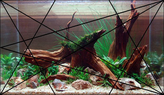 Frank’s work hits some of the triangles but definitely not as many as Luis did. I would give this a 7 out of 10. This shows again why I didn’t get the same feeling when I first saw Frank’s work.
Motion
The final criteria I used was motion. I feel that a sense of motion is important to the overall look of the aquascape and adds a layer of complexity that matches well with what we are trying to achieve. After all, an aquascape is not meant to be a static work of art. It’s nature, fluid and dynamic.
Luis:
 I do not get a sense of motion from Luis’ aquascape. It seems very static to me. Now, I realize it’s tough to make an iwagumi style seem to give a sense of motion and, by its very nature, it is intended to portray permanence and strength. However, I do think the rock layout can be positioned at angles that do give a sense of either wind or water direction. I give it a 4 out of 10.
Frank:
 In stark contrast to Luis’ scape, Frank’s does convey a strong sense of motion in one direction and this makes his composition very dynamic in that respect. I can almost picture the water current moving or wind blowing in that direction. Can’t you? I give it a 9 out of 10.
Conclusion:
In the end, as you can see by counting my ratings, Luis’ composition wins over Frank’s if you are looking strictly at age-old design rules created from knowledge of how human’s perceive. Analyzing the works in this way has allowed me to understand and explain why my first impression was that Luis managed a better overall aquascape than Frank.
Both aquascapes are amazing when you consider that these guys were limited to a few items of hardscape and plants. Add to that an hour time limit and the pressure of an audience of knowledgeable planted tank enthusiasts and you have a pressure cooker of a situation. To me, the 2010 Iron Aquascaper battle was a resounding success. It pitted two skilled aquascapers in head-to-head competition. It was fun to behold and I learned a lot.
I thank Luis and Frank for taking up the challenge. I wonder who will be next…
All the best

8 Comments on “Analysis of 2010 Iron Aquascaper aquariums”
Pingback: 2010 Iron Aquascaper Coverage - Page 2
Art,
What a great post covering the different technical backgrounds that can be applied to an aquascape. Although I am familiar with the golden-ratio technique, I too find the other ones interesting.
With the golden-ratio being commonly known and which aquascapers can use to apply to their aquascape, I wonder how many of the other techniques are used when doing an aquascape? Do you think these techniques come naturally without having to think about it?
Hey Johnny,
Thanks for your kind words.
I doubt that most aquascapers use any other technique besides the rule of thirds that is the most common. For those aquascapers that follow the nature aquarium style, they do follow Japanese gardening techniques that have been developed over centuries.
I think an aquascaper, like a good photographer, should study composition technique to help improve his craft. The trick is not to let these semi-rigid techniques ruin the creative nature of the art.
Art, great explanation of how the aquascaping techniques work, very informative in such few words.
The composition techniques is something that I myself need to learn, if I want to progress on this hobby and start to climb places in competitions, so your site comes at a perfect time.
The irony is that the moss was a last minute addition that should have never happened in my case – it was a rookie mistake that took the focal point away from the true, intended focal point of the right piece. In retrospect (hindsight being 20/20 and all), what I should have done is tied the moss to rocks if I was going to use it (it was brought in last minute at the 45 minute mark), which would have added an extra layer of depth and maintained the focal point in it’s originally intended space. This small change would have completely changed the impact of the layout as a whole.
However, as far as thinking about exact golden ratios, etc, while aquascaping – originally yes, now? Not so much. More and more as you use it it becomes more of an intuition. Obviously revisiting these core concepts is a great strength. I myself have been going through a lot of ‘design phases’ that you could describe as changing / modifying a core philosophy. When seasoned aquascapers talk with one another, the words ‘golden ratio’ or this or that are almost never mentioned, but as a core value almost always stressed. Not for strict adherence, but more so to gain the intuitive ability to place something ‘correctly.’
Pingback: Analysis of Our Preciousss
Pingback: Thelordwolf's Blog
Pingback: Easy aquascaping for beginner?